
Tool Comparison · August 2026
8 Lucidchart Competitors for Marketing Insights That Actually Deliver Results
Miro, Creately, Whimsical, Mural, UXPressia, SketchWow, Coggle, and Microsoft Visio — tested, ranked, and compared so you don’t waste a trial period finding out the hard way.
By Oyekale Olawale · Websites2Know · August 18, 2026
⚡ Quick Answer
If you need one answer right now: Miro Insights is the top Lucidchart alternative for AI-powered marketing feedback analysis, Creately wins for all-in-one campaign strategy execution, and UXPressia is the clear pick for deep customer journey mapping. Scroll down for the full breakdown with pricing, real UX observations, and a comparison table.
How I Tested These Tools
I run Websites2Know, a site focused on AI tool reviews and software comparisons. Over the past three years, I’ve built customer journey maps for SaaS campaigns, facilitated remote strategy workshops for marketing clients, and tested more diagramming tools than I care to admit.
For this review, I evaluated each tool against four marketing-specific criteria: data integration depth (can it connect to CRM or analytics?), collaboration quality (does the team actually use it?), insight synthesis (does it help turn feedback into decisions?), and UX friction (how many clicks to get something done?). I also tracked real bugs and quirks I hit during testing — not polished PR talking points.
Lucidchart is technically solid. But if you’re a marketer trying to synthesize customer insights, map a funnel, or align a go-to-market strategy, it often feels like using a Swiss Army knife to perform surgery. The tools below were built — or meaningfully evolved — for exactly this kind of work.
Lucidchart Competitors at a Glance
| Tool | Starting Price | Best For | Free Plan | AI Features |
|---|---|---|---|---|
| Miro Insights | $8/user/mo (Starter); Insights = Enterprise add-on | AI feedback analysis, PRD generation | ✅ 3 boards | ✅ Yes (Insights add-on) |
| Creately | ~$8/user/mo (billed annually) | Campaign planning, GTM strategy | ✅ Limited items | ⚠️ Basic AI |
| Whimsical | $10/user/mo (Pro) | Funnel wireframes, fast ideation | ✅ 1 editor free | ⚠️ Limited AI |
| Mural | $9.99/user/mo | Workshop facilitation, team synthesis | ✅ Free tier | ⚠️ Basic AI |
| UXPressia | ~$15/user/mo | Customer journey maps, CX metrics | ✅ 1 map, 1 persona | ❌ No |
| SketchWow | ~$39/year (one-time optional) | Hand-drawn visuals, social content | ❌ 30-day refund | ❌ No |
| Coggle | $5/mo (“Awesome” plan) | Mind mapping, content clusters | ✅ 3 private diagrams | ❌ No |
| Microsoft Visio | Free (M365) → $5 Plan 1 → $15 Plan 2/user/mo | Enterprise data viz, Excel integration | ✅ Web-only (M365) | ⚠️ Copilot (M365) |
Marketing Insight Strength Score
Based on hands-on testing across data connectivity, feedback synthesis, collaboration depth, and UI friction — scored out of 10:
Top Lucidchart Competitors for Marketing Insights (Reviewed)
1. Miro (with the Insights Add-on) — Best for AI-Powered Feedback Analysis
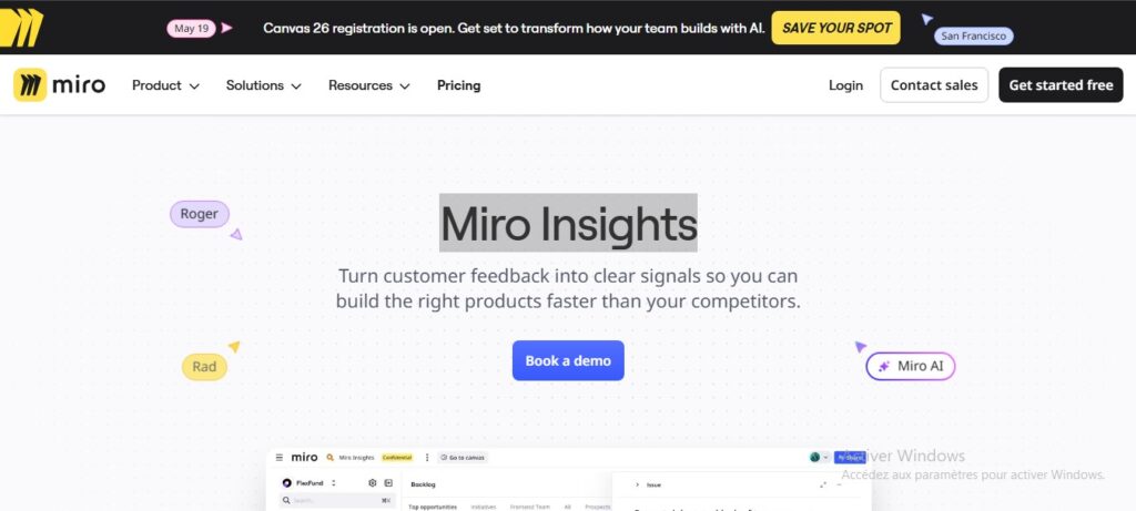
Most people think of Miro as a digital whiteboard covered in sticky notes. That’s still true — but Miro Insights is a different product sitting inside the same UI. It connects directly to your CRM, Slack, and survey tools like Typeform, then uses an AI agent to sift through raw customer verbatim and extract signal from the noise.
The killer feature is “signal extraction.” You dump 200 raw support tickets into the board, and within minutes it clusters them by theme, surfaces key customer quotes, and auto-generates a Product Requirements Doc (PRD) draft. For a Product Marketing Manager buried in feature requests from three different sales calls, this is genuinely useful rather than just impressive in a demo.
Pricing reality check: The standard Miro Starter plan is $8/user/month (billed annually). But Miro Insights is an Enterprise-tier add-on — you’ll need to contact sales for pricing. Budget-conscious teams should be aware that the AI insights functionality is not available on the $8 Starter or even the $20 Business plan.
A UX gripe I hit during testing: The Insights panel and the main canvas have separate navigation paradigms. I found myself accidentally creating a new board when I tried to return to the Insights workspace. The onboarding flow assumes you already know what Miro Insights is, which isn’t great if you’re a marketer who just got handed a new tool by your ops team. If you rely heavily on sales intelligence platforms like ZoomInfo or Apollo for customer data, Miro Insights can serve as the synthesis layer that actually visualizes what that data means in context.
✅ Pros
- AI saves hours of manual feedback tagging
- Generates business cases tied to ARR automatically
- Integrates with Slack, Jira, Typeform, and Salesforce
- 100M+ users → huge template library
❌ Cons
- Insights is an Enterprise add-on — not cheap
- Navigation between Insights and canvas is jarring
- Overwhelming if you just need a simple diagram
2. Creately — Best All-in-One Marketing Strategy Workspace

Creately calls itself a “visual work management platform,” and for marketers, that framing actually means something. Unlike Lucidchart — which is fundamentally a diagram tool with a clean UI — Creately treats the visual canvas as a live workspace where shapes can be directly linked to tasks, databases, and real project statuses.
I tested it on a go-to-market planning workflow. I built a full GTM canvas — personas, product pillars, launch phases — and each persona card was connected to a Kanban task. When the task status changed to “Complete,” the persona card updated automatically. For a solo marketing director juggling multiple deliverables, that feedback loop is genuinely useful. It’s the kind of feature that makes you wonder why other tools haven’t caught up yet.
Creately’s template library is also notably marketing-forward: SWOT analysis, Porter’s Five Forces, customer empathy maps, go-to-market plans, and PESTLE frameworks are all available pre-built. Lucidchart has templates too, but they skew more heavily toward technical diagramming. Creately genuinely feels like it was designed with marketers in the room.
Pricing note: Creately’s entry point is around $8/user/month (billed annually), which makes it competitive. Free exports include a watermark, which is annoying when you want to share work with a client on a free account.
Bug I found: Real-time collaboration worked fine with two people on the same canvas. Adding a third caused noticeable cursor lag — enough to break the flow of a live workshop. For smaller teams, it’s excellent. For live facilitation with 10+ people, I’d look at Mural instead. Many B2B marketing agencies would find Creately a compelling alternative to their current campaign planning tools.
✅ Pros
- Marketing-specific templates (GTM, SWOT, PESTLE)
- Live task & database linking from the canvas
- Integrates with Google Drive, Jira, Confluence
- Smooth drag-and-drop — snappy and responsive
❌ Cons
- Cursor lag with 3+ simultaneous editors
- Watermark on free plan exports
- Initial navigation can feel unintuitive for new users
3. Whimsical — Best for Fast Funnel Ideation and Wireframing

Whimsical is the tool people recommend when someone says “I just need to sketch this out quickly.” And they’re right. The UI is so minimalist it almost feels like a refusal to have features. No overwhelming sidebar, no font-picker rabbit hole — you open it, you draw, you share.
For content marketing teams, I love it for planning campaign funnels and content cluster diagrams. You can map a full SEO content strategy across a mind map, then switch to a flowchart view to show how articles link to each other. The visual consistency between docs, wireframes, and mind maps is better than anything else in this price range.
G2 reviewers give Whimsical a 9.3/10 for ease of use — noticeably ahead of Lucidchart in that category. When I tested it against Lucidchart for building a basic conversion funnel diagram, Whimsical took about half the time. The default styling is also nicer out of the box.
Pricing: Whimsical’s Pro plan is $10/user/month. A Business tier is $15/user/month with more advanced sharing and export options. There’s a free tier with one editor per month — enough to test it properly. Whimsical is particularly well-suited for freelancers who want to boost their productivity without paying enterprise rates for a tool they use once a week.
Real limitation: Whimsical struggles under load. When I built a large mind map with 60+ nodes and heavy text annotations for an SEO audit, the canvas started stuttering noticeably. It’s clearly optimized for simplicity, not complexity. Don’t try to use it for anything resembling a data warehouse architecture diagram — Visio exists for that.
✅ Pros
- Fastest sketch-to-share workflow tested
- Beautiful default styling — minimal design overhead
- Great for wireframes, mind maps, and flowcharts
- G2 ease-of-use: 9.3/10 (vs. Lucidchart’s 8.5)
❌ Cons
- Canvas stutters with 60+ nodes
- No data import or CRM integration
- Not for complex technical diagrams
4. Mural — Best for Customer Co-Creation Workshops

Mural and Miro are the same product category, but they’ve evolved with different philosophies. Miro has leaned into data and AI; Mural has doubled down on facilitation. For marketing insights specifically, that distinction matters a lot depending on where your insights come from.
If your marketing insights come from people — customer interviews, stakeholder workshops, internal retrospectives — Mural is probably the better tool. Its “Super Sort” feature lets participants quickly categorize sticky notes into themes with a drag-and-drop interface that actually holds up under the chaos of a live workshop. The voting system, private mode, and built-in timer create a structured facilitation flow that Miro’s canvas doesn’t quite replicate.
Mural’s G2 rating is 4.6/5 across 1,447 reviews — strong evidence that users are actually satisfied rather than just tolerating it. Enterprise teams make up 44% of Mural’s user base, which tells you something about where it fits in the stack.
The honest trade-off: Mural lacks dynamic diagram support and native data linking. You can’t link a shape to live Excel data the way Visio can. It’s not trying to be a technical diagramming tool — and for workshops, that’s fine. But if your “marketing insights” involve overlaying campaign attribution data on top of a funnel diagram, Mural isn’t where you do that. Pricing starts at $9.99/user/month on paid plans, with a limited free tier available.
✅ Pros
- Best-in-class live facilitation tools (timer, voting, Super Sort)
- Private mode for honest anonymous input
- Strong for agency–client collaboration
- 4.6/5 on G2 across 1,447 reviews
❌ Cons
- No dynamic data linking or live data import
- No layers for complex diagram hierarchies
- Canvas navigation has a learning curve for new users
5. UXPressia — Best for Deep Customer Journey Mapping

UXPressia is the most specialized tool on this list, and that’s exactly why it deserves a spot. This isn’t a general-purpose whiteboard that happens to have a journey map template. It was architected, from the ground up, for Personas, Journey Maps, and Impact Maps — and the depth it offers in those specific areas leaves Lucidchart’s generic templates in the dust.
What impressed me most during testing: you can pull in data from Google Analytics or Mixpanel and overlay quantitative behavioral data directly onto your qualitative journey map. So instead of a persona saying “feels frustrated at checkout” based on interview notes, your map now shows a 67% drop-off at that exact stage, sourced from real analytics. That’s the kind of evidence a CMO can act on in a budget meeting.
The “Journey Score” metric — a proprietary calculation that grades the quality of a customer experience based on touchpoint inputs — is something no other tool on this list offers natively. It’s opinionated, but it gives lifecycle marketing teams a single number to optimize against. If you’re refining advertising management workflows, UXPressia can help you visualize exactly where ad touchpoints fit into the broader customer journey.
Pricing: Free plan covers 1 persona and 1 journey map — enough to evaluate it seriously. Paid plans start around $15/user/month. Fair for what it delivers.
✅ Pros
- Native GA/Mixpanel data overlay on journey maps
- Proprietary “Journey Score” metric
- Multi-persona views with exportable dashboards
- Purpose-built — no feature bloat from unrelated use cases
❌ Cons
- Completely useless for technical/AWS diagramming
- Limited to CX use cases — no flowcharts, wireframes
- Template variety lower than Miro or Creately
Not sure which tool is right for you?
Most of these offer free tiers or trials. Start with UXPressia for CX work, or Miro for AI-powered insight synthesis.
Try Creately Free →6. SketchWow — Best for Visual Storytelling and Social Content

SketchWow fills a niche none of the other tools on this list address: it makes diagrams look like a human drew them. And in a world where corporate decks have become homogenized to the point of invisibility, that’s actually a significant competitive advantage for certain marketing contexts.
I tested it for a client who runs internal marketing training sessions. The hand-drawn style immediately lowered the psychological barrier to engagement — people read the slides rather than zoning out. The animated flowcharts (yes, your arrows can actually move) added a layer of dynamism that held attention in a way that Lucidchart’s pristine vector diagrams never do. Capterra reviews reinforce this: users consistently praise the “WOW factor” and report that audiences respond more positively to SketchWow visuals than to traditional diagram outputs.
Important caveats: SketchWow is a desktop-only application (Windows and Mac). There’s no web version, no mobile app, no tablet support. If your workflow involves collaborating live with a distributed team, this tool isn’t the answer. It’s a solo production tool that outputs finished visuals — not a collaborative workspace. Pricing is notably affordable at around $39/year, making it a very low-risk addition to your toolkit.
✅ Pros
- Unique hand-drawn style — stands out in any deck
- Animated flowcharts included
- Very affordable (~$39/year)
- Excellent for training, internal comms, LinkedIn content
❌ Cons
- Desktop only — no browser or tablet version
- No real-time collaboration
- Templates can look samey if overused
7. Coggle — Best for SEO Content Strategy and Mind Mapping

I’ll be direct: Coggle isn’t trying to compete with Miro or Visio. It does one thing — infinite mind maps — and does it very well. For marketers who need to build a content cluster strategy, plan a campaign calendar, or visually map out the structure of a blog series, Coggle is faster and less cognitively exhausting than any general-purpose tool.
What makes Coggle technically interesting for power users: it supports multiple root nodes and looping branches. Most mind map tools force a single-root hierarchy. Coggle lets you start from three different concepts simultaneously and connect branches across them — which is remarkably useful for mapping topic clusters where one article can logically belong to two separate pillar pages. When combined with an all-in-one SEO platform, Coggle gives you a visual layer on top of keyword data that no spreadsheet can replicate.
The free plan allows up to three private diagrams and unlimited public ones — genuinely generous. The “Awesome” plan at $5/month removes all limits. Google Drive integration means your diagrams live in a familiar ecosystem without extra file management overhead.
✅ Pros
- Multiple root nodes + looping branches (rare feature)
- Generous free tier (3 private + unlimited public)
- Google Drive native integration
- $5/month “Awesome” plan is excellent value
❌ Cons
- Mind maps only — no wireframes, flowcharts, or journey maps
- No CRM or analytics integrations
- Too simple for anything beyond visual brainstorming
8. Microsoft Visio — Best for Enterprise Data Visualization

Microsoft Visio is the old guard, and that reputation is both earned and sometimes unfair. It’s earned because the UI genuinely feels dated compared to Miro or Whimsical. It’s unfair because nothing else on this list can touch it when your marketing data lives in Excel or Power BI and you need to turn it into a board-ready strategy diagram.
Visio’s native Excel data linking is a real differentiator. You connect a Visio shape to a row in your spreadsheet, and when the Excel data updates, the shape updates automatically. For an enterprise marketing team tracking campaign attribution across 15 regions, that eliminates an entire manual update workflow every quarter.
Visio’s recent template additions are worth noting: Porter’s Five Forces, PESTLE analysis, and marketing mix frameworks (4 Ps) are now available out of the box. These weren’t there two years ago. Microsoft is slowly making Visio more relevant to marketing strategists, not just IT architects.
Pricing is tiered and reasonable if you’re already in M365: A basic Visio experience is included in many M365 plans at no extra cost. Visio Plan 1 (web-only, professional diagrams) is $5/user/month. Visio Plan 2 (full desktop app + advanced data linking + larger shapes library) is $15/user/month. Understanding data visualization best practices will help you get more out of Visio’s powerful linking features faster.
The honest limitation: Non-technical team members avoid it. I’ve seen marketing coordinators refuse to open Visio files because the interface intimidates them — even when the end output is a simple org chart. If team adoption is your primary concern, Miro or Whimsical will serve you better even if they’re technically less powerful.
✅ Pros
- Native Excel/Power BI data linking — unmatched
- Enterprise-grade security and compliance (HIPAA, SOC2)
- Porter’s Five Forces, PESTLE, 4Ps templates built-in
- Plan 1 at $5/user/mo is genuinely affordable
❌ Cons
- Intimidating UI — low non-technical team adoption
- Desktop app is Windows-only (no Mac native)
- Feels clunky next to modern web tools
How to Choose the Right Tool for Your Marketing Use Case
I get asked this question in almost every software review I publish, so let me make it simple. Ask yourself these three questions before signing up for anything:
Question 1 — Where do your insights actually come from? If they come from customer interviews and workshop sessions, prioritize Mural or UXPressia. If they come from survey data and CRM exports, prioritize Miro Insights. If they come from analytics dashboards, UXPressia’s Google Analytics overlay or Visio’s Excel linking will serve you better than any whiteboard. Tools like Semrush are often used alongside these diagramming tools to provide the keyword and competitor data that feeds into your marketing strategy maps.
Question 2 — Who else needs to use it? This matters more than people admit. The best insight tool is the one your team actually opens. If your colleagues are non-technical, Miro or Whimsical will get consistent adoption. Visio will not. I’ve watched too many tool rollouts fail because the platform was chosen for its feature set rather than its UX.
Question 3 — Do you need to present, or do you need to decide? If you’re presenting insights to a board or senior stakeholders, SketchWow’s visual style or Visio’s polished framework templates work best. If you’re trying to make a decision from a pile of customer data, Miro Insights or UXPressia will get you there faster. When using AI-powered tools, it’s also worth understanding how Google AI Overviews are affecting content discovery — which affects what kind of marketing insights matter most in 2026.
Recommended Tool by Marketing Role
| Marketing Role | Primary Need | Top Pick | Runner-Up |
|---|---|---|---|
| Product Marketing Manager | Synthesize customer feedback → PRD | Miro Insights | UXPressia |
| CX / Lifecycle Marketer | Journey maps with real analytics overlay | UXPressia | Creately |
| Brand / Comms Strategist | Workshop facilitation, stakeholder alignment | Mural | Miro |
| Content / SEO Strategist | Topic cluster mapping, content calendar | Coggle | Whimsical |
| Social Media Manager | Engaging visual content for posts/training | SketchWow | Whimsical |
| Growth / Startup Marketer | Fast funnel sketches, rapid iteration | Whimsical | Creately |
| Enterprise B2B Marketer | Excel/Power BI data linked to diagrams | Microsoft Visio | Miro (Business plan) |
Frequently Asked Questions
Is Lucidchart good for marketing insights?
Lucidchart excels at static technical diagramming — flowcharts, org charts, network maps. For marketing insights, it lacks native AI feedback synthesis, CRM integrations, and CX-specific metrics. It has data linking, but competitors like Miro Insights and UXPressia offer purpose-built analytics-to-visual workflows that Lucidchart can’t replicate out of the box.
Which tool is best for building customer personas?
UXPressia is the clear winner for persona creation. Unlike generic whiteboard tools, UXPressia provides structured fields for goals, pains, gains, behavioral data, and quantitative metrics — all exportable as a shareable PDF or live dashboard. Free tier includes 1 persona and 1 journey map, which is enough to evaluate it seriously. As a secondary option, Miro has persona templates that integrate with its broader feedback analysis workflows.
Can Whimsical handle complex marketing funnels?
Yes, with a caveat. Whimsical is excellent for early-stage funnel sketching and campaign wireframing. However, canvases with 60+ nodes and heavy text annotation cause noticeable performance degradation. It’s optimized for speed and clarity, not for large-scale data-dense diagrams. If your funnel involves more than two or three campaign stages with multiple data points per stage, Creately or Miro will handle the complexity better.
What is the best free Lucidchart alternative for mind mapping?
Coggle offers the most generous free mind map experience: 3 private diagrams and unlimited public ones at no cost. For slightly more complexity (multi-root branching, collaborative editing), Whimsical’s free tier with one editor per month is also a strong option. Both are significantly faster to onboard than Lucidchart for pure mind mapping workflows. Using these tools alongside a tool like SearchAtlas can give your content cluster maps real SEO data behind them.
Is Microsoft Visio worth it if I already have Microsoft 365?
If you’re already in the M365 ecosystem and your marketing data lives primarily in Excel or Power BI, yes. The Visio web viewer is included in many M365 plans at no extra cost, and Plan 1 at $5/user/month adds full diagramming. The Excel data-linking feature alone can justify the cost for enterprise marketing teams that need to keep strategy diagrams synchronized with live campaign data. Non-technical team members will still find the interface challenging, which is its main limitation.
Does Miro Insights work without an Enterprise plan?
No — Miro Insights (the AI-powered customer feedback synthesis add-on) is only available as an Enterprise plan add-on. Standard Miro boards on Starter ($8/user/month) and Business ($20/user/month) do not include the Insights product. This is an important distinction: you can use Miro’s general AI features (like Miro AI for content generation) on Business, but the full customer signal extraction and PRD generation require an Enterprise contract with Insights enabled. Contact Miro’s sales team for custom pricing.
Conclusion: Which One Should You Actually Use?
After testing all eight of these tools hands-on, here’s my honest take:
Lucidchart is not a bad tool. It’s a technically excellent diagramming tool that happens to be positioned as a general-purpose solution. But “general purpose” often means “optimized for nothing specific” — and for marketers who need to turn noisy customer data into clear strategic decisions, that’s a real limitation.
If I had to pick one tool for most marketing teams: Creately. It covers the widest range of marketing use cases — strategy frameworks, campaign planning, collaborative execution — at a price that doesn’t require an enterprise budget conversation. The task-linking feature is genuinely differentiated. For teams who rely on insights from AI tools built for small businesses, Creately slots in well as the visual planning layer on top of your existing tool stack.
If you specifically need AI-powered feedback synthesis: Miro Insights — but budget for Enterprise. If you’re a CX-focused lifecycle marketer: UXPressia. If you’re a solo marketer on a tight budget: Whimsical or Coggle depending on whether you need wireframes or mind maps.
The common thread across the best performers: they were built with a specific marketing workflow in mind, not retrofitted from an engineering or IT context. That intentionality shows up in every hour you spend using them.
Ready to replace Lucidchart in your marketing stack?
Start with the free tiers — most of these tools offer enough to complete a real project before you pay anything.
About the Author
Oyekale Olawale runs Websites2Know, an independent platform reviewing AI tools and SaaS software. He tests each tool across real workflows — not demos — and publishes reviews based on hands-on evaluation. Reviews are written independently; no vendors pay for favorable coverage.